Interactive dashboards are basically the sliced bread of data visualization. They are dynamic, easy to use, and compatible with Mac and PC. This tutorial is best applied to clients who are tracking a domain’s rankings in multiple locations. But, these principles can be used to make many interactive dashboards. This tutorial was heavily inspired by Annie Cushing, author of Annielytics, and her interactive chart blog post. Alright, let’s get started!
If you would rather watch the tutorial, here it is:
For you readers out there, carry on. There will be links to the specific part of the video tutorial for each of these steps.
Collecting the Data
I first started this dashboard by exporting the ranking data from my grouped site Olive Garden. Once you’ve collected the ranking data from each of your cities, compile that data into one document.
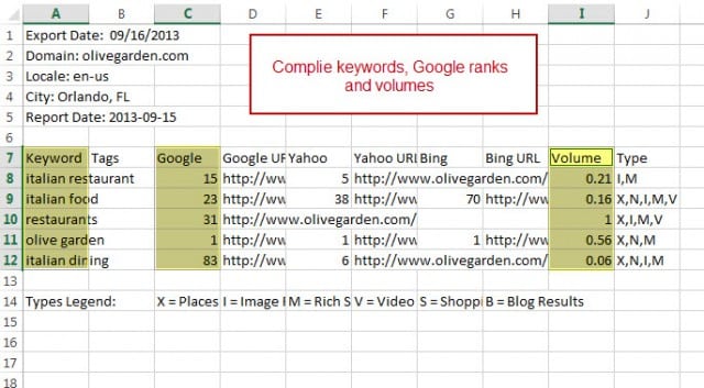
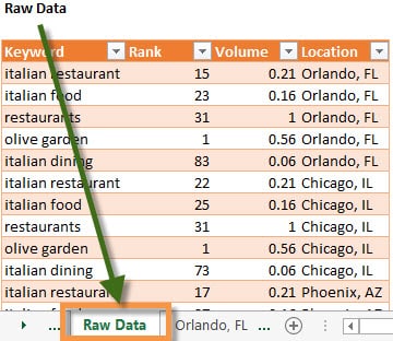
Next, grab the Keywords, Google rank, and Search Volume for each of the cities and add that data to one table in your Raw Data tab. Pro Tip: The Raw Data tab is sacrosanct, it should be kept free of formulas and charts. Save that for the Calculated Data tab.
Calculate the Data
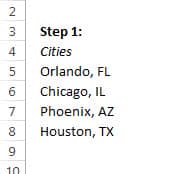
The first step in calculating the data is creating a list of cities. You can type this out manually, use a VLOOKUP, or just copy and paste.
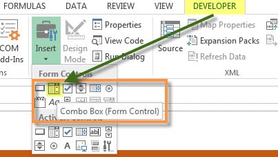
The second step is a little bit more labor intensive. First make sure that you have the Developer tab open. You have to select this tab to viewable through File > Options > Customize Ribbon. Then you will need to create a Combo Box using the Form Controls.
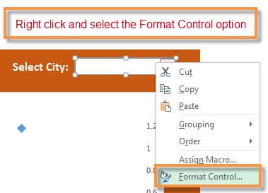
Once you have drawn out the Combo Box, right click to select Format Control.
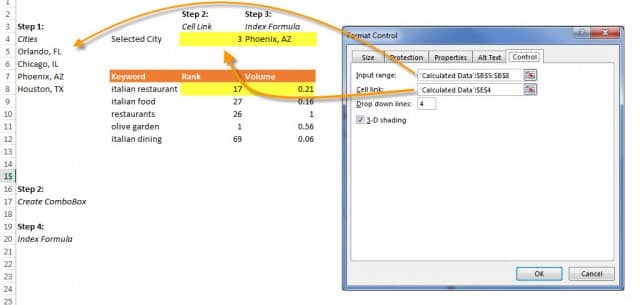
Now here is the fun part. Under the Control tab, select the Input range to be the list of cities you made earlier. (That will be the list that your Combo Box shows.) Next, select your output, or Cell link. Lastly, change the Drop down lines to 4 (because we only have four cities).
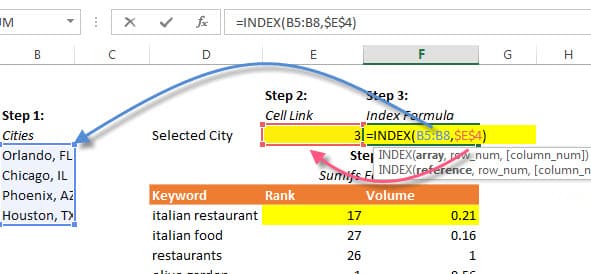
The third step is to put in an INDEX formula. This formula will allow you to look up the Cell Link we set up earlier, and output from our Cities list. This means that when you select Chicago, IL on the Dashboard tab, it will output the text, “Chicago, IL” in that cell.
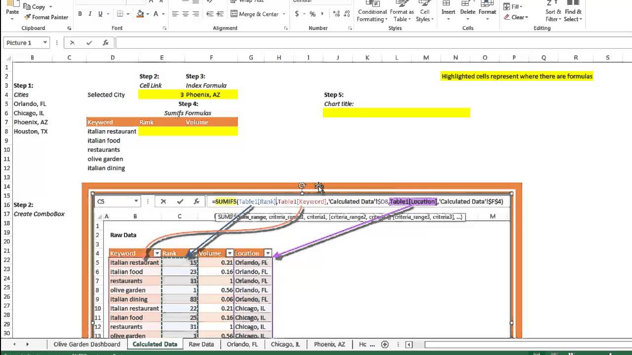
Collect Location Specific Data
Bring over the data from the Raw Data tab with a SUMIFS formula. Never worked with SUMIFS? No problem, just follow this handy-dandy image. I would recommend referencing the video tutorial for this bit.
SUMIFS have two criteria that need to be met to output the data you’re looking for. The first criteria in our SUMIFS will be finding the Rank number for the Keyword “italian restaurant”.
![]()
The second criteria will look to make sure that Keyword matches the location in cell F4 (where our INDEX formula is).
![]()
The second SUMIFS formula is exactly the same as the first except for in the “sum_range” you select “Table1[Volume]” instead of Rank.
Concatenation Formula
In this step you will perform a simple concatenation formula. It will combine the text string “Keyword Ranks & Search Volume for ” and the city that the user will select from the Combo Box (which is in cell F4).
![]()
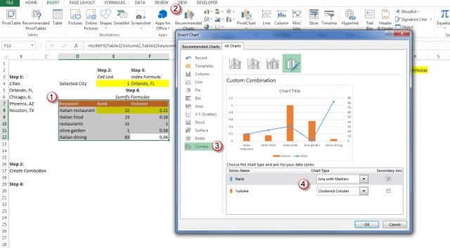
Create the Chart
Create the chart by navigating to the Insert tab and selecting Recommended Charts > All Charts > Combo Charts. Make the Rank data a Line with Markers chart, and the Volume a Clustered Column chart. Also, move the Rank to a Secondary Axis. Move the chart to the Dashboard tab.
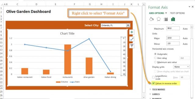
Format the Chart
Now that the Rank data is on a secondary axis, reverse the order of the values. This will allow you to view the Rank data in the order that one is positive, and 100 is negative.
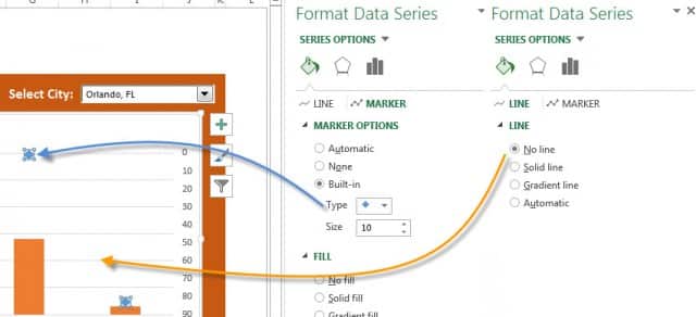
I like to remove the line and just leave the markers. You can do this by right-clicking on the line and clicking “Format Data Series”. Also, add in the Primary and Secondary Vertical Axis Titles. That way we know which axis is Rank data and which is Volume data.
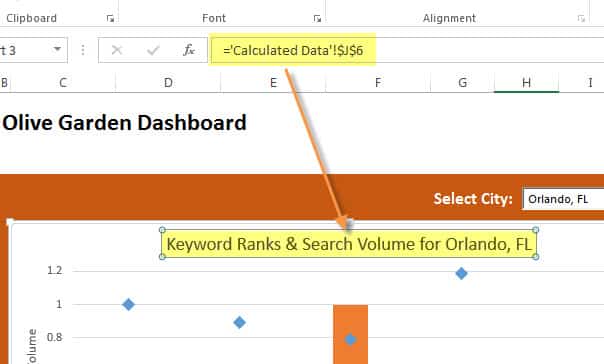
Add the Chart Title
This is where the chart title we made in the Calculated Data tab will come into play. We want our chart title to automatically update when a user selects a different city.
Ta-Da!
Congratulations on making your first Interactive Dashboard!