I have done several Excel tutorials in the past and I know that they have been helpful to those with a background in Excel. But this post is for the marketers who have only opened Excel when a .csv has no where else to go… and they still look like this:

Making It Pretty
First we’re going to take a old busted .csv and make it the new hotness. Who really wants to look at ugly data all day? Here are a steps I take when I first open a .csv.
- Gridlines
- 10px cell padding in A1
- Deleting/hiding unnecessary data
- Giving the document a title
Pro Tip: Save as an Excel Workbook first. If you save the document as a .csv all the formatting will be lost.
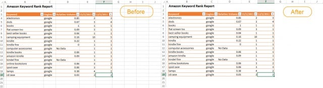
1. Gridlines are for noobs. Trust me, your data will look 10 times more clean and professional with the Gridlines turned off. Under the View tab deselect the Gridlines box. Here’s a before and after beauty shot of Gridlines.
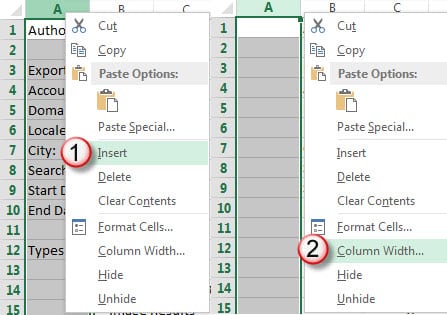
2. To add some cell padding, navigate to the far left column and right-click, select insert 1 cell to the left. Then change that cell to be 0.1 (12px) wide. This give that little bit of padding before your title and charts.
3. I don’t need all the details of my export, I really just like to delete all of that. To do this you click-drag your mouse across the cells to select them. Once selected you can either hit the delete key, or right-click and select Delete.

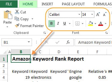
4. This is the easy part. Simply type in your title “Amazon Keyword Rank Report” and on the Home tab you will have text editing options. I would make the size of the title at least 14pt.
Adding a Table
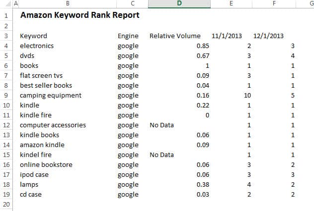
From here I selected only the most important data that I wanted to focus on. Since this a comparison report, I selected the column of data for the first of November and December. I also am only looking at the data from Google. So now my raw data looks like this.
Tables are great for being able to filter your data and organize it better. Not to mention how tables are just prettier than raw data. To add one you can navigate through the ribbon by selecting the Insert tab > Table > Create Table. Or just hit Control + T.
You’ll see that another tab pops up when you create your table, this is the Design tab. From here you can customize your table.

Adding a Chart
Adding a chart is something that intimidates most Excel noobs. But it’s very simple. I’m creating this chart to show the Relative Volume data. To do this I select the data I want to show.
Select the Keyword and Relative Volume columns by holding down the Ctrl key and dragging the selection. From there navigate to the Insert tab and select the chart options. I chose a 2-D column chart. From there you can edit the colors of your chart in the Design tab.

You did it! You now know how to format your data, create tables and a simple chart. Stay tuned for more tips in the Excel 102!
